One Design System, From Our Website to Your Desktop
Why we rebuilt the HomeDock OS website and README around the same design system as the desktop: the squircle icon, the system palette and the README
 Néstor González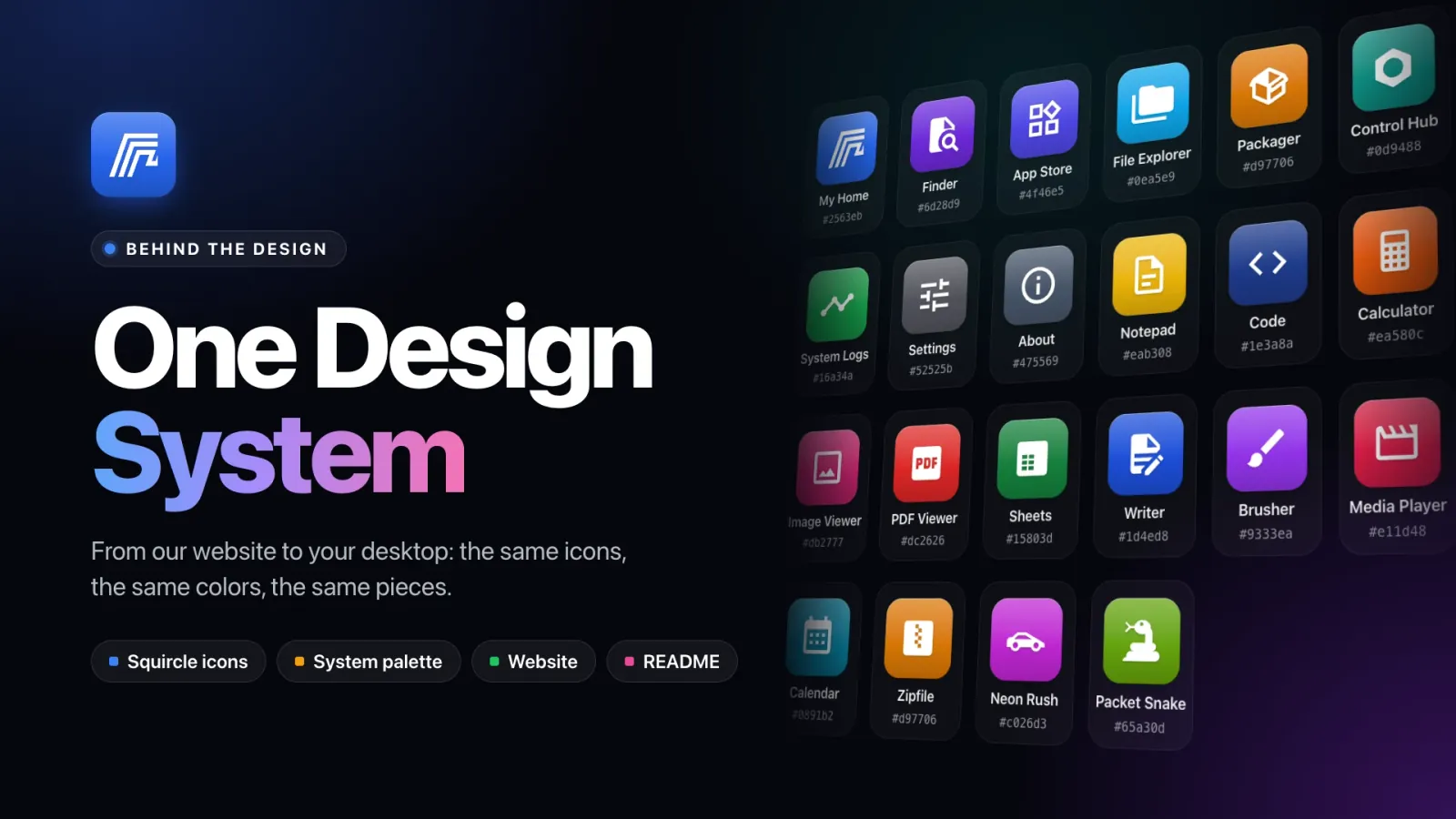
If you have visited homedock.cloud in the last few days, you might have thought you had landed on the wrong site. You hadn’t. We rebuilt the website almost from scratch, and the README on GitHub along with it, and this post is about why, and about the small set of rules all three now share.
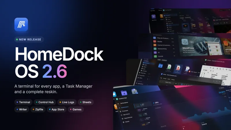
The short version: with HomeDock OS 2.6 the desktop got a new coat of paint down to the last icon. Then we looked at our website, at our README and at the desktop side by side, and they looked like three products made by three different companies.
Why Rebuild a Website That Worked?
Because what people see before installing should be what they end up using.
Almost nobody meets HomeDock OS on its own desktop. They meet it on this website, on a GitHub README, or in a screenshot someone posted. That first impression is a promise, and the product has to keep it. If the website shows one style of icons, the README another and the desktop a third, the first minute after installing is spent recognising nothing. You read about Sheets, you look for the thing you saw, and it isn’t there, because it never looked like that.
So we stopped designing the website as a website. The website, the README and HomeDock OS now share a single design system, and that system is the desktop’s own. When you see an icon here, it is the icon you will double-click there. Same shape, same color, same symbol, same shadow.
One Source of Truth, and It’s the OS
There is no separate brand book that drifts out of date, and no Figma file that disagrees with the code. The colors come from the configuration files of HomeDock OS itself: the list of system apps, the built-in utilities, the games and the file types. The demos on our home page aren’t screenshots or videos either: they’re HomeDock OS redrawn in code, the same layout, classes and measurements as the Vue components on your desktop, ported to React so they can live on a web page.
The website’s App Store is laid out like the one in HomeDock OS, with a sidebar of categories and how many apps each holds, rows with a real squircle icon and a Get pill. App pages open with the same header as the install screen. Even blog categories got a tile of their own.
Here is one piece in all three places at once. Pick an app and flip GitHub between light and dark:
Sheets
Open, edit and save Excel spreadsheets.
| Sheets Open, edit and save Excel spreadsheets. |
The Squircle: One Tile for Everything
The piece doing most of the work is the app icon: a rounded square in the app’s own color with a white symbol on top. You see it on the desktop, in the Start menu, the taskbar, title bars, My Home, Finder and the File Explorer, and now on every page of this website and every row of the README.
It looks simple, and it’s meant to, but it’s five layers stacked on top of each other, and every one of them is computed from a single color:
- Shape. A squircle with a 22.5% radius. Being a percentage, the curve keeps its character at any size.
- Gradient. The color mixed with 28% white at the top, pure at 55%, and with 18% black at the bottom. That is the whole trick: you give it one hex code and it gets volume for free.
- Edge. A one-pixel line of light along the top and a half-pixel hairline all around, so the tile holds its outline on a white page and on a black desktop alike.
- Glyph. A white Material Design Icon at 58% of the tile, with a one-pixel shadow underneath.
- Depth. Two soft shadows, one tight and one wide, so the tile sits on the surface instead of being printed on it.
Below 28 pixels the recipe changes. Highlights and drop shadows that look lovely at 48 pixels turn into mud at 20, so small tiles drop them and the glyph grows to 68% to stay readable in a taskbar or a list. And a stopped app doesn’t get a different icon: it’s the same tile at half brightness and in grayscale, paused is dimmed, and a freshly created container goes sepia.
Because it’s all derived from one color, adding an app to the system means picking exactly one hex code. And because it’s plain CSS, the very same line of code draws the tile in the Vue desktop, in React on this website, and in the HTML we turn into images for the README.
The System Palette, and Why Each App Wears Its Color
Twenty-two system apps, utilities and games ship with HomeDock OS, and every one of them has a color. These are the real values, straight from the source. Pick one to see why it wears what it wears:
Spreadsheet green, one step deeper than the green-600 of the .xlsx files it opens.
None of those colors were picked by throwing darts. There are five rules behind them:
- Conventions first. Spreadsheets are green, word processors are blue, PDFs are red, archives are cardboard-box amber, notes are legal-pad yellow and calculators have orange keys. Decades of software taught you that, and fighting it would only make you read labels you shouldn’t need to read.
- The 600 step is home. Most colors come from Tailwind’s 600 step: dark enough for a white glyph to read on top, light enough not to go muddy once the gradient adds its 18% of black at the bottom.
- Step aside to avoid twins. When two things would look the same, one moves a step. Sheets and Writer sit one step deeper (700) than the .xlsx and .docx files they open (600), so an app is never mistaken for one of its documents. The File Explorer is sky-500 because sky-600 already belongs to code files, Finder is violet-700 because violet-600 is video, and Notepad stays on yellow-500 because yellow-600 turns brown.
- Same hue, same kind of thing. Packager, Zipfile and every .zip in your File Explorer share the exact same amber: they’re all boxes. Control Hub wears teal, the theme’s own success color, because its job is to tell you everything is fine.
- Configuration stays quiet. Settings is a neutral zinc and About is slate-600, the very color any app without one of its own falls back to. Nobody installs HomeDock OS for its settings window, so it shouldn’t shout.
The payoff is that you learn the desktop by color before you read a single name. After a day or two, your hand goes to the green tile for a spreadsheet and the amber one for an archive without thinking about it, the way it goes to the red app for a PDF on any other computer.
One Hue, Three Places
Those colors don’t stop at app icons. Every file type in HomeDock OS has its own color, and the README uses exactly the same ones for the format badges in its table:
That is cohesion you can test. Look at the format table on GitHub, install HomeDock OS, open the File Explorer, and the green XLSX badge you read about is the green .xlsx file you double-click, which opens in the slightly deeper green of Sheets.
The README, Rebuilt With the Same Pieces
The
GitHub has a light theme and a dark one, so the large banners come in both versions and swap automatically with a <picture> element. The icons in the tables don’t need to: a tile brings its own background, so one image looks right on both. Flip it yourself:
Your Apps, Under Control
File Management
800+ Apps
Security & Encryption
Networking
The colors follow the same rules as the desktop: green for what keeps things healthy (logs, updates, a hardened setup), red for the things that need fixing (CVE patching), amber for keys and boxes, sky for files and addresses, neutral greys for configuration. Every screenshot in the README is cropped from the real thing at 1920×880 and never scaled. And at the very end, for the few who scroll that far, there’s a thank-you.txt opened in the same Notepad you will find on your desktop.
Light Where You Read, Dark Where You Work
One last rule, and it’s a deliberate one: this website is light, and only light. There’s no dark mode and no switch. A website is somewhere you come to read, and long text reads best on paper-white.
What is dark is what was always dark: the desktop. Every demo of HomeDock OS on these pages uses Noir, the dark theme of the desktop, with its exact surface, border and text values, so a window on our home page looks like a window on your screen. The app carousel and the call-to-action banners use the same values. Light pages, dark screens, one set of numbers for each:
What It Means for You
- What you see is what you install. The icons, colors and windows on this website and in the README are the ones on your desktop.
- You already know your way around before you sign in for the first time, because you’ve seen every tile already.
- It stays that way. Every color on this website has a known home in the HomeDock OS source. Today they’re still a handful of files we keep in step by hand, but they hold the same values, and we know exactly where each one lives.
If you would like to see the real thing, HomeDock OS is free to install on Linux, macOS, Windows or a Raspberry Pi. And if you notice an icon on this website that doesn’t match the one on your desktop, tell us on
Thanks for being part of this journey ❤️
Related Links